The Beautiful Game
Journal
In a month of very big news for our clients the Homeless World Cup, we can now show you the tournament identity we’ve just completed for Seoul 2024.
“Our logo was designed to capture the spirit of the host city and people.”
This is the first Homeless World Cup tournament to be hosted in South Korea - and also our first project in the Far East. 50 countries and 500 players will compete across 8-days in the world class sporting spectacle (for a fictionalised representation of how the tournament works, check out The Beautiful Game on Netflix!). We’ve worked with the Homeless World Cup for several years, refining and evolving their brand, so we were delighted when they invited us to work on the logo for the 2024 tournament.
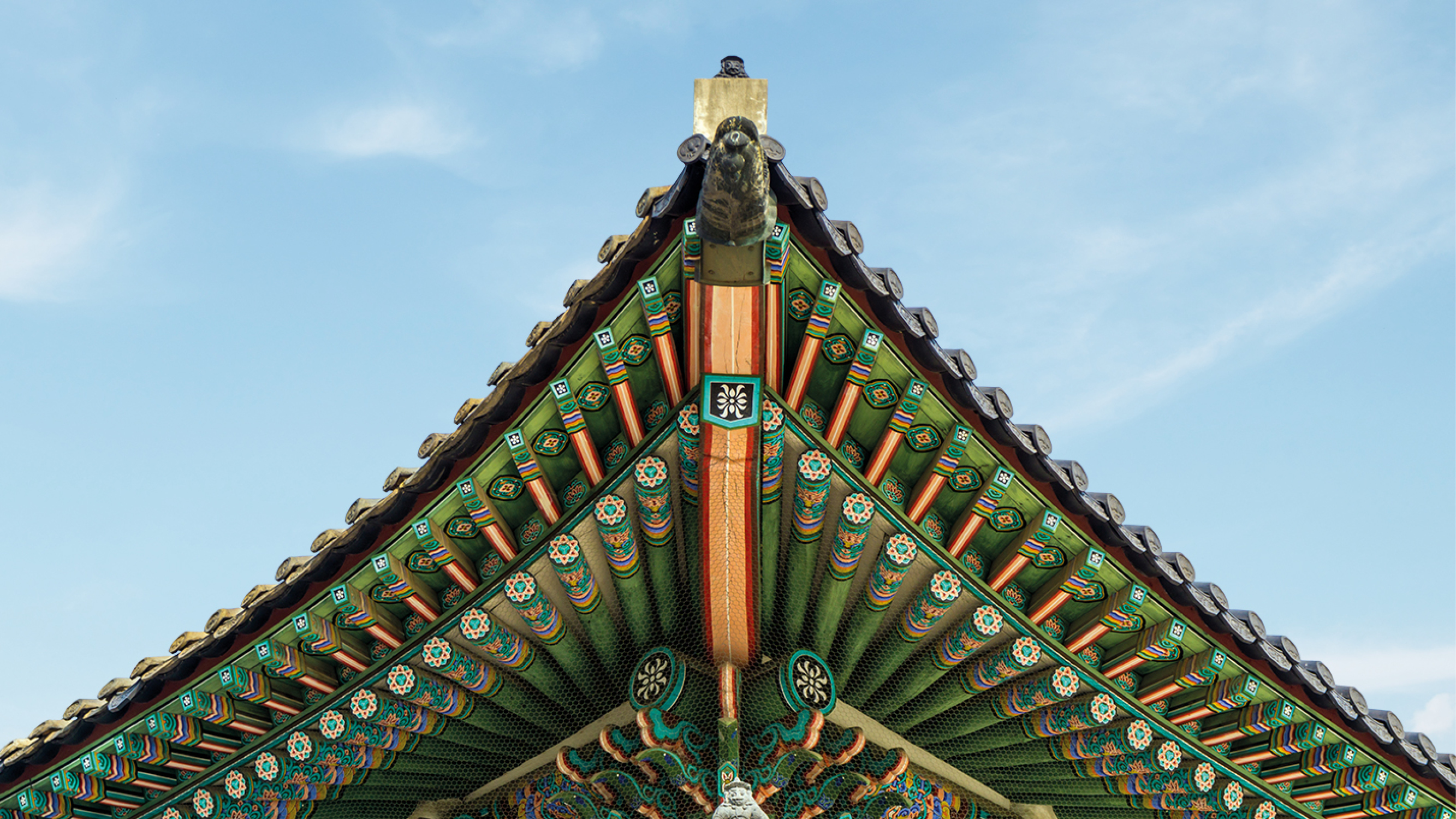
Our logo was designed to capture the spirit of the host city and people. The core inspiration for the logo comes from Dancheong, a native painting technique used to decorate South Korea’s stunning temples and palaces, including Gyeongbokgung Palace, located in Northern Seoul. In Dancheong, symmetry is essential, so we kept that in mind when we distilled the art form down to a suite of hexagons, itself a reference to the geometric panelling on a football. We used three of Korea's five traditional colours: blue to represent heaven, red for earth, and yellow for humanity. The logo is pieced together from these colours and shapes to form something bigger: the Homeless World Cup is more than a tournament.
The 2024 tournament will take place at Hanyang University from Saturday 21st September – Saturday 28th September.

