Tangent features on the forthcoming BBC4 episode of ‘The Beauty of Diagrams’. The six part series sees mathematician Marcus du Sautoy explore the stories behind some of the world’s most familiar and iconic diagrams.
“We wanted to create a diagram that highlighted the human impact behind the statistics.”
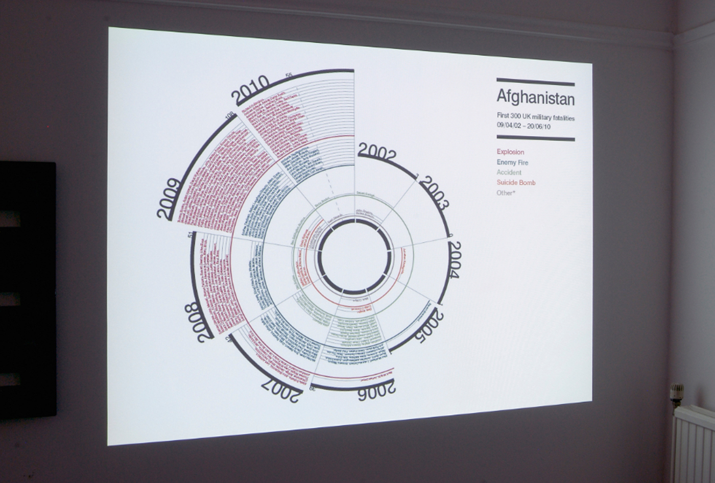
Tern TV approached Tangent to design an infographic to document casualties in the Afghanistan war. Our work was inspired by Florence Nightingale’s famous infographic of the Crimean war, a central focus of the episode.
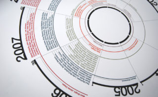
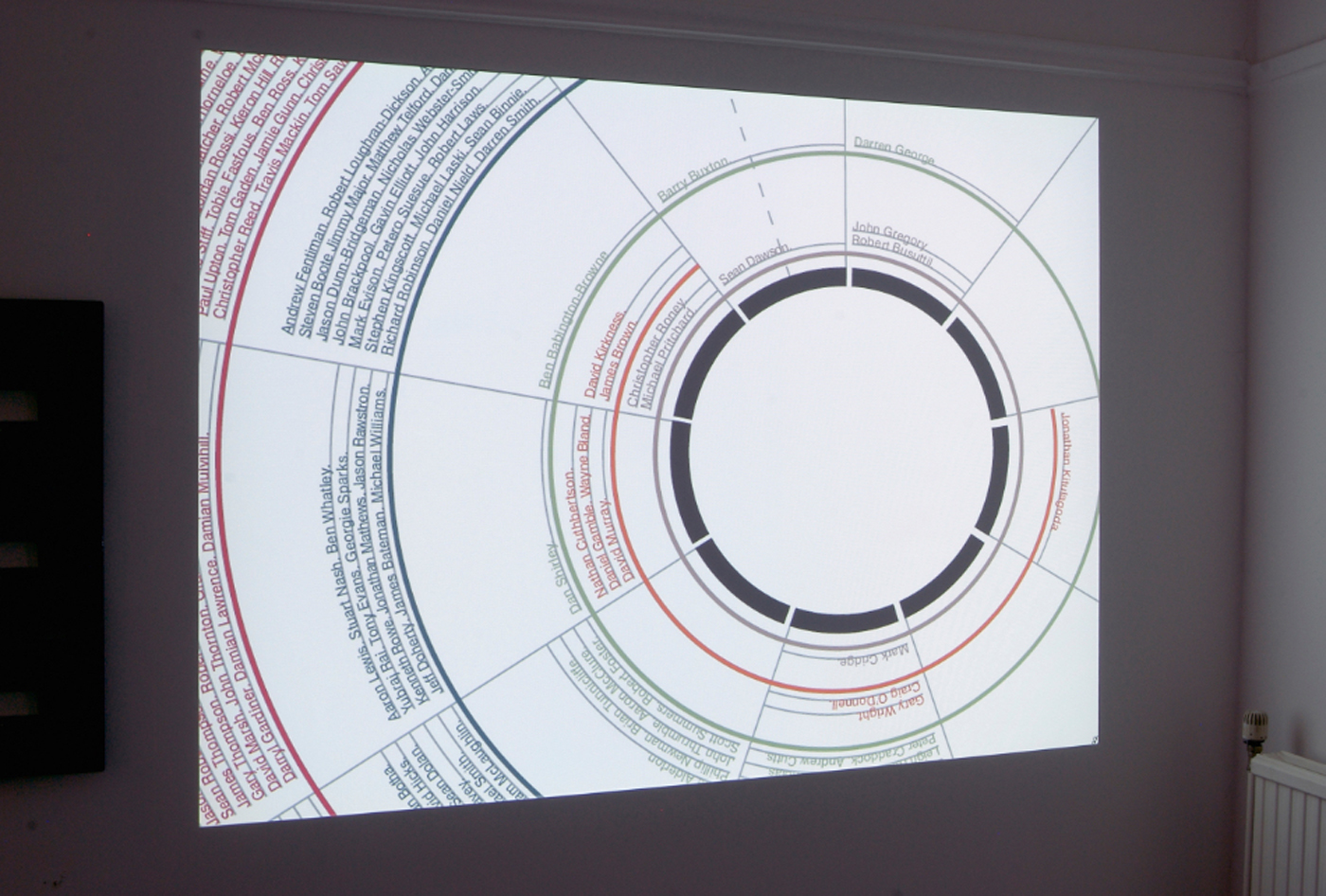
We wanted to create a diagram that highlighted the human impact behind the statistics, so we listed each casualty by name within the design. By showing the raw data within the visualisation there is no scope to exaggerate or understate the statistics – an honest and straightforward way to approach such a serious subject.
Florence Nightingale’s diagram demonstrated in a clear and concise way that poor sanitary conditions were responsible for more deaths than occurred on the battlefield. Our updated version shows at a glance that troops in Afghanistan were much more at risk from roadside bombs than actual enemy combat, and also that death rates escalated year on year – well past the point where the war was considered ‘over’.
Watch on BBC iPlayer:
https://www.bbc.co.uk/programm...


